%402x.svg)


Background
ORX Travel provides travel agencies with customizable booking platforms tailored specifically to their brands. These platforms allow travel managers and employees to effortlessly book flights, hotels, and car rentals—all managed from a streamlined dashboard. In this project, my primary goal as a UX/Product Designer was to simplify how travel managers create and enforce internal travel policies. Previously, the task was done manually, travel managers would have to review policies for every trip, causing headaches for managers and delays for travellers.
Imagine having to individually verify every employee’s flight booking against the company's detailed travel policy. It’s not fun. It's tedious, prone to human error, and honestly frustrating for everyone involved. Employees had to wait around for travel manager approvals, causing unnecessary delays and frustration.
We needed to transition from manual checks by managers to an automated, intuitive policy builder, allowing managers to effortlessly create flexible rules. This would enable travellers to independently select compliant travel options without waiting for manual approvals.
Objective
Problem: Travel managers were manually checking every employee's booking against detailed company policies, resulting in slow approvals, frequent mistakes, and frustrated employees waiting on the sidelines. This manual approach wasted everyone's time and negatively impacted overall user satisfaction.
Objective: Design an intuitive, automated policy builder that allows travel managers to create dynamic rules. Employees could then independently book travel that aligns seamlessly with company guidelines, removing unnecessary friction and delays from the entire booking process.
Execution
Discovery & Research
To start, I explored how other platforms outside the travel industry tackled similar filtering challenges. I stumbled upon a really insightful article from pencilandpaper.io about advanced filtering techniques. It introduced the idea of using additive formulas, which basically means layering multiple criteria on top of each other to create super-flexible combinations. Immediately, a lightbulb went off in my head: this was exactly what our travel managers needed to simplify complex policy creation.
Inspired by this, I broke down our policy builder into three clear, logical components:
- Identifiers (things like fare price, flight duration, or destination)
- Relatives (connectors like "greater than," "less than," or "includes")
- Values (specific details, like "$1000," "Economy class," or "New York")
This gave us a straightforward structure to build our filters around, making it easy for travel managers to construct clear, understandable policies even if they weren't tech-savvy.
Define
From my research and initial insights, I narrowed down our target to a few specific policy scenarios that travel managers consistently struggled with. By speaking directly with users and reviewing existing policy setups, we identified four core areas our filtering system needed to support:
- Fare Price: Managers needed a way to set price thresholds that prevented employees from booking overly expensive tickets.
- Flight Duration: Long-haul flights booked just for loyalty points were a common issue, so filters needed to account for trip length and discourage unnecessary travel time.
- Ticket Class: Policies around economy, premium, and business class varied by company and even by role, so we needed to make it easy to enforce those guidelines with minimal friction.
- Destination: Managers wanted to guide or restrict travel to certain cities or regions based on budget, safety, or strategic value.
These four policy types became the foundation of our logic system. They were broad enough to cover most company needs but specific enough to keep the experience focused.
We also grounded our work in two primary user types: corporate travel admins setting policies at scale, and employees navigating those rules during booking. This dual perspective helped ensure the logic felt powerful without being overwhelming, and that each filter could be understood in seconds, whether you were building the policy or following it.
Objective
Our primary goal was straightforward: design a flexible, easy-to-use policy builder. It had to enable travel managers to quickly create clear, dynamic rules around fare prices, flight durations, ticket classes, and destinations. By making these rules easy to set up and understand, employees would see compliant travel options upfront, completely removing the guesswork and manual approval process.
Develop & Ideation
This is where the fun really started. Inspired by the sentence-based filtering systems I'd explored in tools like Notion and Airtable, I began sketching concepts that let travel managers create policies using natural language and intuitive dropdown menus. The goal was to make complex rules feel straightforward and human.
My journey began with a deep dive into the world of advanced filters


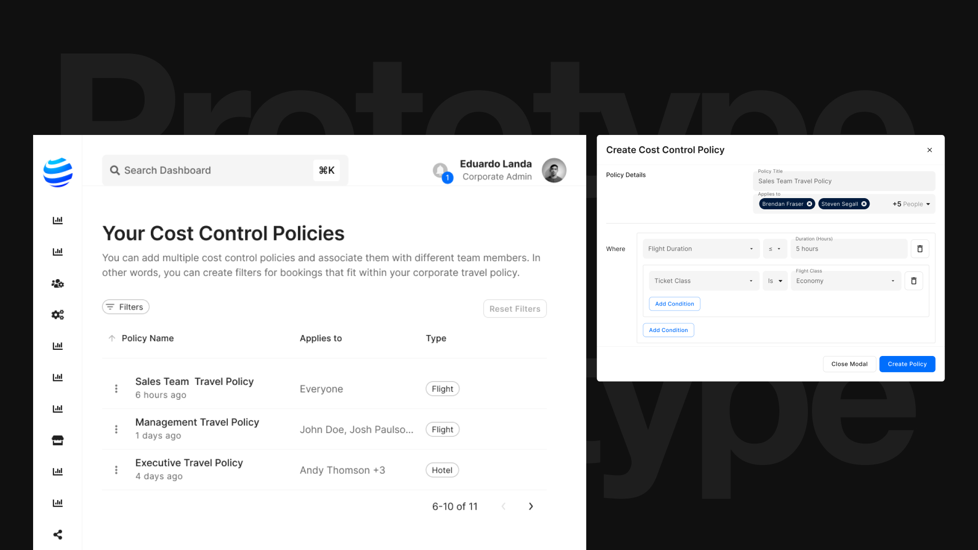
For instance, instead of cryptic forms or complicated logic trees, managers could now build rules that read naturally, something like:
“If the ticket price is greater than $1,000, restrict booking.” or “If the flight duration is greater than 6 hours, limit ticket class to economy.”
I created rough sketches first, then moved quickly into mid-fidelity prototypes, regularly reviewing with the team to ensure the designs felt intuitive and matched user expectations. Each round of feedback made the interface clearer and easier to use, while still retaining the powerful flexibility our travel managers needed.
Wireframes
Next, I translated the strongest concepts into low-fidelity wireframes to visualize how the filtering logic would live inside our existing dashboard. These early wireframes helped us spot structural issues right away, like where certain controls needed more breathing room or how labels could better guide the user through policy creation.

The main focus here was clarity. Each wireframe showed how a travel manager could select an identifier, choose a condition, and enter a value to form a complete policy sentence. For example:
"If flight duration is greater than 6 hours, limit ticket class to economy."
Once the structure felt solid, I moved into mid-fidelity interactive prototypes. This stage was key for gathering targeted feedback, not just from the product team, but directly from our internal travel management group. Since they represented our real-world users, their insights were especially valuable.
Through usability testing sessions, we evaluated how intuitive the filtering logic felt, how quickly managers could create rules, and where they hesitated or second-guessed their inputs. Their feedback led to several key refinements, such as improving the sentence flow, reducing dropdown clutter, and surfacing key actions more clearly.

Delivery and Implementation
With the designs finalized, I shifted focus toward implementation. I organized and documented all functional requirements in Linear, linking each task directly to relevant Figma components. This ensured developers had a clear reference for how each filter should behave, including interaction logic, empty states, and edge cases.
We used Material UI as the foundation for building out the interface. This helped keep the design consistent and scalable, and also made the development process more efficient by aligning closely with our existing component system. It allowed us to focus on refining the filtering experience without having to spend extra time building visual elements from scratch.
Throughout the build process, I worked closely with developers to make sure everything translated as expected. I conducted QA from a design perspective, reviewed the implementation of logic across different identifiers, and adjusted designs where needed based on technical feedback.
By staying involved from start to finish, I helped ensure the solution met both user needs and engineering requirements, resulting in a policy builder that felt seamless for managers and sustainable for the product team.


Impact
The new policy builder immediately made a difference for both our users and our team.
For travel managers, the experience of setting up policies shifted from a slow, manual task to something fast, logical, and even enjoyable. Instead of relying on memory or post-it notes for policy rules, they now had a tool that let them build dynamic, flexible filters with confidence. Managers could visualize the outcome of each rule as they built it, which reduced uncertainty and led to fewer booking errors down the line.
In the first 8 weeks after launch, we saw a 17% reduction in non-compliant bookings across early adopter accounts. This improvement was driven by better visibility into policy guidelines during the booking process and more consistent application of rules at scale.
For ORX Travel, this project helped elevate our product positioning. We weren’t just a booking engine anymore—we were actively reducing administrative overhead and making compliance easier to maintain across teams of all sizes.
Next Steps & Lessons Learned
While the launch of the policy builder was a strong step forward, there were still areas we planned to evolve post-release.
What’s next:
- Expanded filtering logic, including multi-condition policies (e.g. “If destination is international and flight duration exceeds 8 hours…”).
- More real-time feedback in the UI, so users can immediately see how a filter will affect available options before applying it.
- Filter templates to give travel managers a head start when building policies. These pre-built examples would cover common scenarios like budget restrictions, long-haul flight limitations, or destination-based rules, making setup faster and more approachable.
What I learned:
One of the biggest takeaways from this project was the value of involving real users early and often. The feedback from our internal travel managers shaped not just the interface, but the underlying logic and structure of the entire system. What we thought would be the most intuitive solution didn’t always hold up under real usage, and those small usability tweaks made a big difference in the end.
I also saw how powerful systems thinking can be. By aligning the UI with a clear structure, both visually and in how it was implemented, we made it easier to build, easier to scale, and easier for users to trust.
Reflection
This project was a great reminder that powerful tools don’t have to feel complicated. By breaking filtering logic down into familiar sentence patterns and giving travel managers just the right amount of control, we built something flexible without overwhelming the user.
What stood out most to me was how much value came from cross-industry inspiration. We didn’t reinvent filtering, we just adapted proven ideas from tools like Notion!


